Identity: RYOBI Packaging
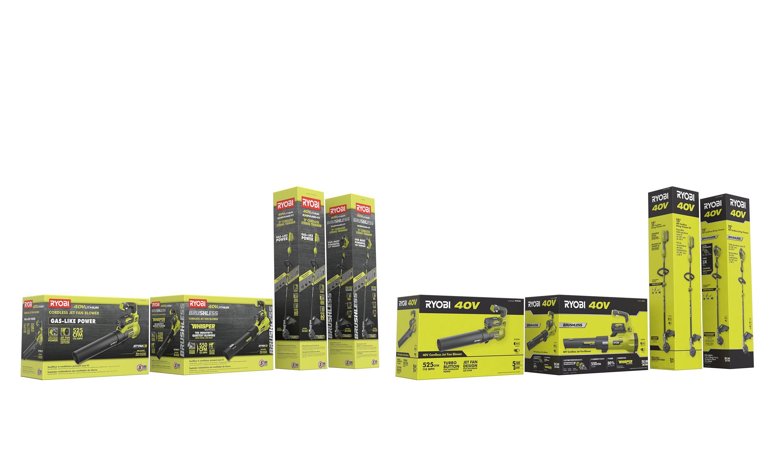
Early concepts exploring RYOBI 40V and 18V battery powered outdoor package identity.


Samples of RYOBI Outdoor Lawn and Garden 18V and 40V Cordless Packaging Prior to Redesign


Early Concepts for 18V and 40V Packaging designed to differentiate between entry level products and high performance premium products.


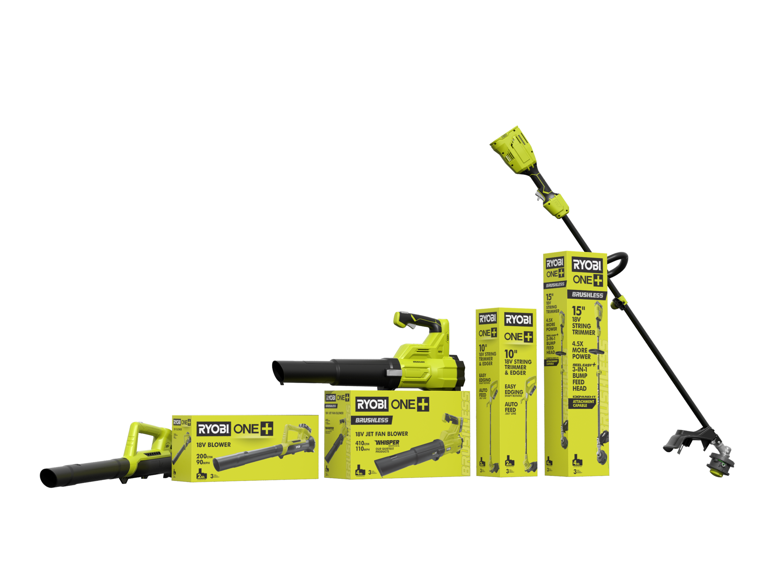
Final Production 18V and 40V Cordless Packaging:
Executive Creative Directors: John Griffith, Rodney Risling
Creative Director: Tim Smith
Senior Art Directors: Brett Rawlings, Nicole Finch
Additional Designers and Art Directors: Jason Barry, Trisha Russell, Brian Lord, Tatsiana Radzkova
RYOBI Packaging Redesign Goals
Consistency:
Alignment of RYOBI Outdoor Power Equipment and RYOBI Power Tools Products through visual brand language and merchandising strategy.
Clarity:
Packages must immediately answer: Who is the product for? What is the value it offers?
Predictable order, placement and hierarchy of information across tools and categories.
Impact:
RYOBI packages become the primary symbol of the RYOBI brand in stores; communicating a reliable and consistent RYOBI user experience across a growing breadth of product categories

Redesign Approach:
Research of existing cordless tool market pointed to paths for content simplification and product differentiation.
Reduce redundancy, ornamentation and visual noise.
Differentiation through visual hierarchy.
Increase prominence of brand color.
Reduced typeface variation.
Concise product call-outs communicate high value features for each retail price point.

